Part 2
Once I felt I had a decent handle on the witches' character designs and at least some idea of what kind of world they lived in, I moved on to layouts. Because the book is about a parade, I chose a horizontal format for the pages. Then I thought about how all of the movement and momentum in the book is very processional. I wanted the layout structure to convey a feeling of progression, so I decided that for this book it was going to make sense to start with wireframes. This would allow me to get an idea of how things might work without putting a lot of "sweat equity" into sketches that might never be used.
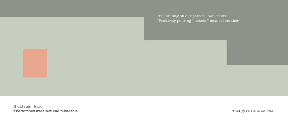
I wasn't quite ready to invest any drawing time, so I started blocking things out with a series of rectangle shapes to represent the positions of the storm clouds (dark green) and Delia (orange). This is what the opening sequence looked like:
Kind of boring to look at, but this really helped me start thinking about how the book should flow.
Next I swapped out the orange boxes with rough poses of Delia to help give me a better sense of where to place the rest of the witches in each spread. As with Delia, I used simple boxes to show placement at first. Once I began creating spaces for all of the primary characters I discovered that I needed more room for everything to breathe. So I stretched out the page format a bit more, allowing each spread a longer horizontal space. Around this time I began thinking of the story as if it were playing out on a wide theater stage with a huge scrolling background.
Note that in this sequence I've also shifted the text forward to allow the page break to occur after "The witches were thrilled...at first." Turning a page creates a longer pause than punctuation, and I always try to take advantage of this for the best dramatic effect. Of course, moving the text around can create a domino effect throughout the rest of the book, and getting everything to break just right can be a real head-scratcher.
Once I blocked out the entire book like this, it was time to combine the concept sketches (see Part 1) with my layouts.
For these sketches I used a 0.7 Pentel mechanical pencil on Bienfang 360 marker paper. After I scanned the sketches I added some digital watercolor as a very basic value study.


