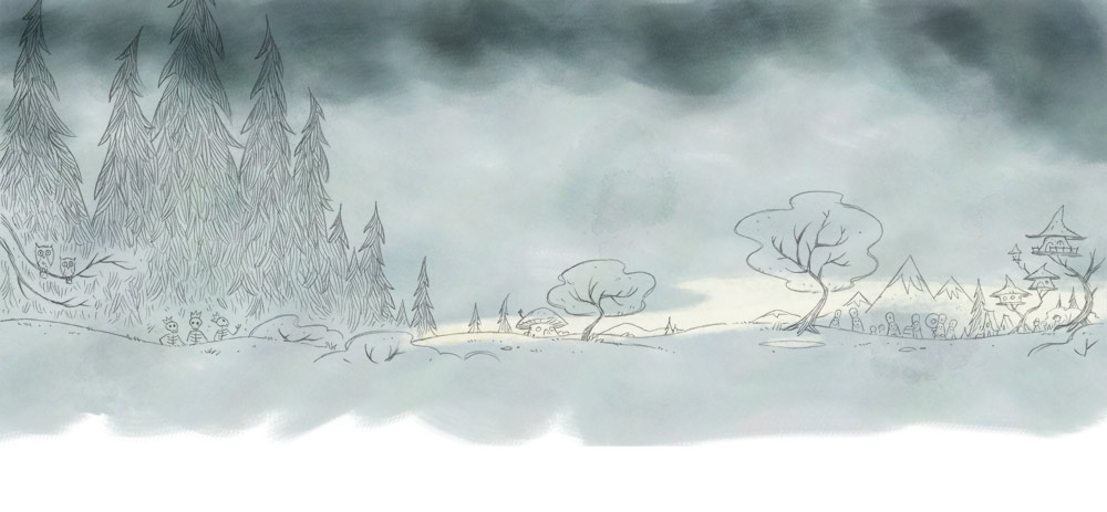
Lately I’ve been interested in working small and letting the surface textures and paint speak up. This is a detail area from a 2.5” x 4.25” thumbnail for a new book I’m working on with Blake. If you’re viewing this on a desktop screen, click on the image to enlarge and get a better sense of what I’m shooting for.
Mostly gouache and colored pencil on black watercolor board, there are some things going here that probably wouldn’t be happening if I were working larger and with more control over detail. Since I’m working in a tiny space, I’m forced to keep my marks rudimentary. I’m handicapping myself in the hope that it’ll bring out something primitive and magical that’s not entirely calculated.
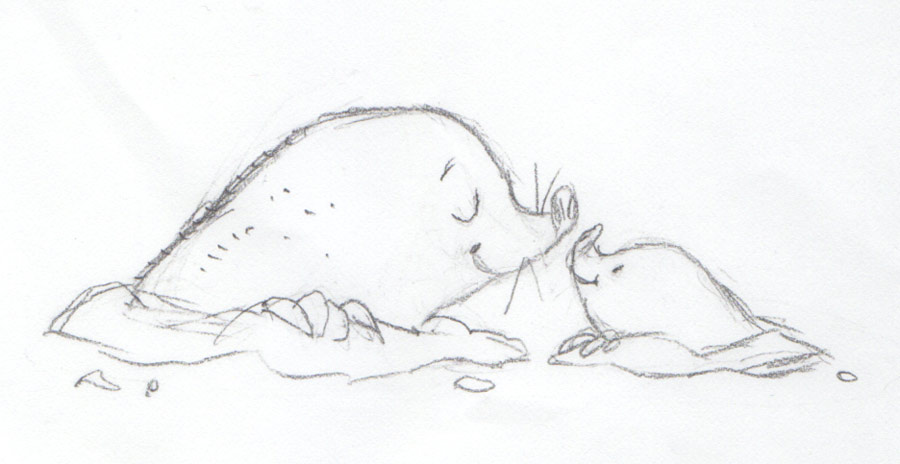
Landscapes are one thing; creating expressive characters and animals in tiny space will be another. Hope to have more experiments to post here soon.
-SH
Color decisions: All Kinds Of Kisses
I approached the color design for All Kinds Of Kisses a little differently than I do for most books. Usually I'll begin imagining color schemes while I'm working out initial pencil sketches, and then during render tests I'll try to establish a set of colors that will govern the entire book. This usually involves an at least somewhat limited palette.
For instance, even though the Ella books were colorful, they were actually limited to 8-10 core colors. Which isn't all that limited, but the same reds and browns and blues are everywhere. Some colors were excluded; there was rarely any pink or purple. Standardizing color helps give books a signature look and takes a lot of time-consuming "color deliberation" out of the illustration process.
For this book, however, I wanted to flip the script and create a unique color mood for each image. I started by collecting my thumbnail sketches into a grid so I could see how all of these colors would play together.
Next I blocked out the spreads with bright colors (thinking of them as "jewel tones"), leaving negative space for text placements I'd already worked out in InDesign. I wanted to push the color brightness more than usual without getting garish. Even though I wasn't working with a palette per sé, I tried to maintain visual unity with consistent saturation levels. After a few false starts, I had a series of frames that seemed to work pretty well. A couple of of them weren't quite as exciting as others color-wise, but I felt that once the characters were dropped in that this would change.
I combined the color layouts with my thumbnail sketches and began painting in my characters, but I was careful not to add too much detail. Since I was going to share this with the editorial team at Feiwel & Friends and we hadn't completely defined the characters yet, I wanted to keep the focus on color. Review of the finished character designs came later.
I essentially reduced the characters to design elements by leaving out any facial features. You could tell what they were, but they weren't 'alive'. A few more changes were made to the background colors at this point, but for the most part they worked as planned. I felt that the hummingbirds, for example, ended up working better over mostly negative space.
I don't do a color script for every book, but it made sense for this one. It helped give Feiwel & Friends a good idea of where I wanted to go with things without going too far out on a limb in terms of time. It also turned out to be a big time-saver once I got approval and began the final art phase. I enlarged each of the finished thumbs and dropped them into the production files as reference layers that could be easily sampled.
-SH
Herbert's First Halloween: Who is Herbert?
In early 2015 Chronicle editor Melissa Manlove sent me the manuscript for a story called Herbert's First Halloween and asked if I'd be interested in illustrating it. I'd always admired Chronicle's catalog, and Cynthia Rylant's story was ridiculously charming - so the answer was a definite YES.
Melissa said they were picturing the story with animal characters. What kind of animals was an open question, however. Discovering who - and what - Herbert was became my first exploration for this book. Looking at the finished artwork now, it seems obvious that Herbert should be a pig - but that wasn't clear when I started.
So I began sketching different kinds of animals, partially to figure out the best animal 'fit' for Herbert and his father, and partially to start figuring out the illustration style I'd eventually use.
First I drew bears.
Then I drew raccoons.
I tried pigs...
... and finally hedgehogs.
In the end, it was decided that an uncertain little pig dressing up for Halloween would be the funniest and possibly cutest way to go. Later, when I got around to working out the neighborhood scenes, I decided that Herbert's neighbors were all different kinds of animals. So most of the characters that tried out for the part of Herbert got to be extras, at least.
And that is story of how Herbert came to be a pig and not a hedgehog.
-SH
Herbert's First Halloween is due in bookstores August 2017.
All Kinds Of Kisses: Style development
What kind of illustration does the story want?
That's usually the first question that comes to mind when I read a new manuscript. I have a couple of go-to styles that I generally rely on: the soft charcoal lines of Ella The Elegant Elephant and the detailed inks of A Lucky Author Has A Dog - but I imagined something different for All Kinds Of Kisses. I wanted bold, simple, brightly colored art that would take up an entire spreads for each verse of Heather Swain's charming story. I wanted a look that would have appeal for pre-schoolers and would work well if scaled down for a possible board book companion. But taking on a new style always means extra development time.
I chose a verse about anteaters to begin the style exploration for this book. During my animal research I found a photo of a baby anteater riding its mother's back, which seemed like a good place to start.
The first study was done quickly in Painter, without a sketch.
This helped me start to get a feel for the anteater shapes and possible character treatments. But the profile view seemed a little static, so I tried sketching a few different poses. Keeping the scale and proportions of the final spread in mind and leaving room for text, I decided on a foreshortened view of the creatures approaching the reader.
Although I abandoned the original profile view, notice that I preserved an aspect of that pose by turning the mother's head to the side, which allows the reader to see the full length of her snout and tongue - a key, recognizable feature that I wanted to preserve.
I'd run across an old Richard Scarry illustration of a bear in my research and thought that might be a nice jumping-off point for a different kind of rendering with no outlines. I wanted to see what this sort of furry texture would look with my new sketch. So, looking at this...
...I came up with this.
Not perfect, but I the fur texture was interesting and the relationship between the mother and baby was sweet. More than anything, though, I was intrigued by the challenge of defining the characters with light and value rather than line. But something wasn't quite clicking. I gave it another shot, this time dropping in some scenery.
The old brown tones of the previous study got a little lost in the warm desert background, so I re-worked the characters with complementary cool tones to help them really stand out. When I finished, I thought I'd landed on a nice style to apply to the rest of the book - at first. When I looked at it again the next morning, however, it still wasn't quite right. I felt I was getting closer to my destination, but the flat background art began to suggest a new possibility.
What if I simplified and flattened the animals as well?
Flattening the characters was a fairly radical change that took a few attempts to get right. It meant that I couldn't rely on light and shadow to define volume and space, and since I wasn't using line work to define shapes I had to rely on value and (to a lesser extent) hue.
In the final version the character heads were re-defined by a color break rather than a structural bulge, and rounded contours were replaced with more angular shapes. The previous fur and hair textures were also flattened into smoother surfaces with just a bit of subtle lighting. Moving the mouth closer to the eyes made the facial features more anthropomorphic and relatable as well.
I'll be honest, I did mutter under my breath and pull my hair more than once on this project - but the perseverance seems to have paid off. By taking the time to develop a style outside of my comfort zone I was able to bring All Kinds Of Kisses closer to the potential I'd imagined the first time I read the story.
SH
New release: All Kinds Of Kisses
I'm very pleased to announce the December 26th release of All Kinds Of Kisses, my first collaboration with author Heather Swain. Published by Feiwel & Friends, it's already received a very nice review from Publisher's Weekly.
As you can see above, the art is a dramatic switch from the style I've been using over the past few years. I'll talk about the style, the production process and more in an upcoming post.
A companion book, How Many Hugs?, will be released next year.
It's Raining Bats & Frogs: final art production
Part 3
As a former window display artist, the idea of having this story play out on a sort of panoramic stage had special appeal to me. In terms of structure, I approached it more or less in the same way I would have approached a display window. First I broke the scenes into two basic planes: the background (environment) and foreground (characters and props). I knew there were going to be a lot of busy scenes with many characters, and that I'd probably want to move things around before settling into a final composition. So instead of drawing the background art around my characters as I usually do, I drew a complete background "stage" for each spread. That way I'd have more control over fine-tuning things after all of the parts were created.
I started by using my rough sketch for reference:
Then I removed all foreground elements and created a tighter drawing in pencil.
The background plane for each spread was actually made up of several sub-layers grouped together. I usually started with the far background "sky", which I created in Painter using a set of custom watercolor brushes.
Next, I added a flat base color fill to the background objects.
Using my color fills as a selection source, I added a second, richer layer of digital paint. I played around with the color jitter settings to keep things from looking too flat and controlled.
When I was done with this step, I added my text matte.
With the background art completed, I turned my attention to the characters. Using my rough sketch again as reference, I drew finished versions of the witches. Notice there's very little shading. Volume, shadow and color would be added digitally.
Using the same approach that I did painting the background, I added a flat base color.
The base color not only served as underpainting, it provided me with an easy way to make selections to constrain the next layer of paint.
Once the witches were done, I added them to my background.
I did the same thing for the bats and frogs falling from the sky that I did for the characters: fine-tuning the pencil lines, scanning and adding color.
The final step: adding a matte for the text.
Notice that the text matte above cuts a straight, steady line across the bottom of the scene. This is the format I used for scenes in the book where the witches think that everything's going great. But when things started going wrong, I switched to an irregular border to help push the feeling of chaos:
Re-reading this, it almost sounds like these illustrations were as easy as 1-2-3. In reality, Bats & Frogs took longer than most books I've done. As usual, there was a lot of muttering and grumbling and feeling lost in the weeds... maybe more than usual. But that's all part of the deal, at least for me. Once I finally got my game plan into place and established the production workflow, things went pretty smoothly... but I wouldn't say fast.
I learned a lot with this book and was lucky to have great support and insights from the creative team at Feiwel & Friends and my long-suffering wife Blake.
It's Raining Bats & Frogs: laying out the pages
Part 2
Once I felt I had a decent handle on the witches' character designs and at least some idea of what kind of world they lived in, I moved on to layouts. Because the book is about a parade, I chose a horizontal format for the pages. Then I thought about how all of the movement and momentum in the book is very processional. I wanted the layout structure to convey a feeling of progression, so I decided that for this book it was going to make sense to start with wireframes. This would allow me to get an idea of how things might work without putting a lot of "sweat equity" into sketches that might never be used.
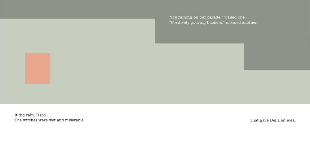
I wasn't quite ready to invest any drawing time, so I started blocking things out with a series of rectangle shapes to represent the positions of the storm clouds (dark green) and Delia (orange). This is what the opening sequence looked like:
Kind of boring to look at, but this really helped me start thinking about how the book should flow.
Next I swapped out the orange boxes with rough poses of Delia to help give me a better sense of where to place the rest of the witches in each spread. As with Delia, I used simple boxes to show placement at first. Once I began creating spaces for all of the primary characters I discovered that I needed more room for everything to breathe. So I stretched out the page format a bit more, allowing each spread a longer horizontal space. Around this time I began thinking of the story as if it were playing out on a wide theater stage with a huge scrolling background.
Note that in this sequence I've also shifted the text forward to allow the page break to occur after "The witches were thrilled...at first." Turning a page creates a longer pause than punctuation, and I always try to take advantage of this for the best dramatic effect. Of course, moving the text around can create a domino effect throughout the rest of the book, and getting everything to break just right can be a real head-scratcher.
Once I blocked out the entire book like this, it was time to combine the concept sketches (see Part 1) with my layouts.
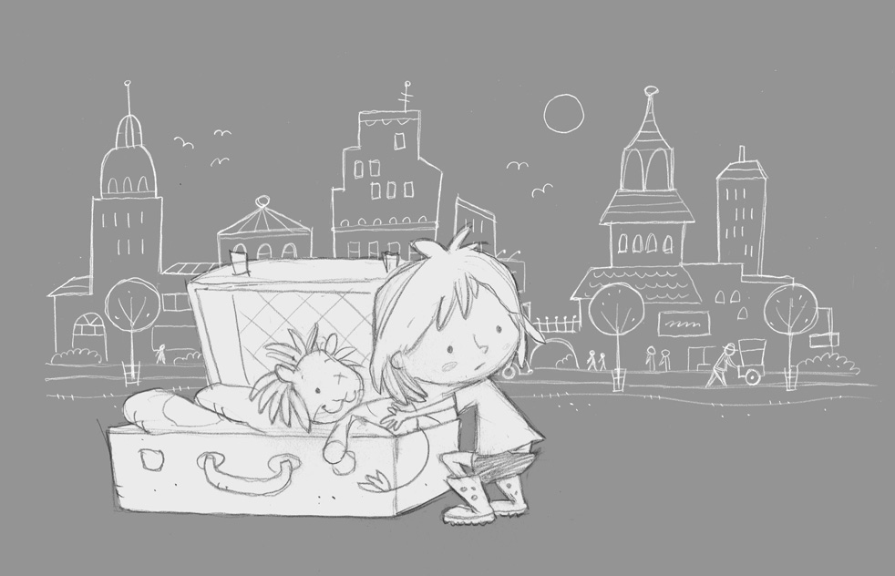
For these sketches I used a 0.7 Pentel mechanical pencil on Bienfang 360 marker paper. After I scanned the sketches I added some digital watercolor as a very basic value study.
It's Raining Bats & Frogs: early concept art
Part 1
Since it just came out, I thought I'd do a few posts on the illustrations for It's Raining Bats & Frogs. I'll start with my early rough sketches and follow up with a couple of other posts outlining my approach to the layouts and some of the production techniques and tools.
I loved the humor and wit of Rebecca Colby's story the first time I read it. The situations and the pacing perfectly frame the "be careful what you wish for" messaging, and right away I started imagining what the characters might look like - starting with the main character of Delia.
At first I drew her like this:
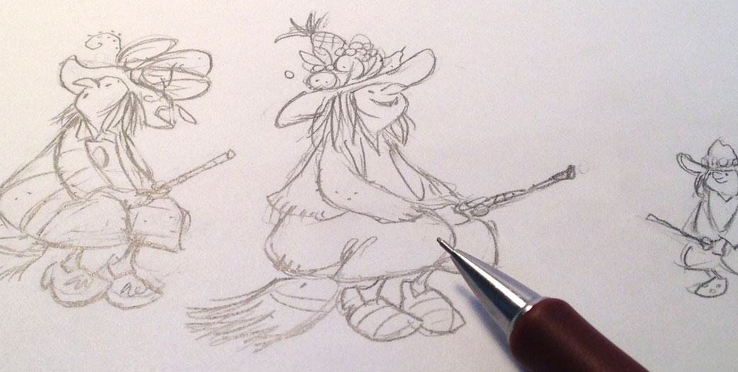
Next I wondered how many witches should be in the parade. The book never really says. I decided to keep the group smallish, partly in order to give each witch a little bit of personality, and partly because I wanted to finish the book in my lifetime.
After I sketched out a series of seven dancing witches, I said to myself "Well, this looks fun... but it's hard to tell Delia apart from the others." I realized that, while it might be easy to assume that Delia is the lead witch here, it would be harder to pick her out in some of the busier scenes of the book. So I decided to make her smaller - the littlest witch. I hoped that this might also make her a little more relatable to kids. After talking with Liz and Rich at Feiwel & Friends, we decided to soften the look of all of the witches a bit as well.
Later on I would define the characters and their costumes even further. I ended up tacking this guide up near my drawing board so I could keep track of everyone:
I thought some more about what a young Delia might look like...
... and I decided she needed a sidekick. A pet crow seemed about right for a little witch.
Once I began to get a handle on what these characters might look like, I turned my attention to the world they lived in. I grew up in the foothills of the Cascade mountains where it rained a lot, so naturally I thought a rainy mountaintop village would be perfect.
Mushrooms huts and treehouses gave the scenes fairy tale vibe that seemed to work. A fantastic parade seemed to want a fantastic stage. Which, incidentally, is how I began to imagine this book: as a play on a stage with a giant scrolling background. I think it was the processional nature of a parade that suggested this.
Mixed with these landscapes you can see that I was beginning to work out some page layout ideas.
Isolating scanned drawings
Back in the days I was illustrating the Ella The Elephant books, I used Photoshop's Multiply blending mode on the layer containing my scanned charcoal line work in order to add digital color underneath. That technique worked well for those books, but for other projects I found the Multiply mode rather limiting. What I really wanted to do was separate the artwork from the paper, isolating it without losing any detail. First I tried simply selecting the artwork and deleting the paper, but that still left a lot of white 'paper' behind. Using the Magic Wand and the Magic Eraser wasn't accurate enough either. Finally I figured out a way to preserve all of the drawing detail by using Channels.
Here's the step-by-step breakdown.
1. Scan your artwork into Photoshop as usual.
At this point it's a good idea to clean up the drawing and adjust the levels (Command-L) so that all of the areas you want to remove are white. This usually means brightening things up a bit, particularly if you want to remove paper texture, etc.
It's a good idea to get your levels set before extraction, by the way. Once all white is removed from the image you will not be able to make further changes to the levels.
2. Open the Channels tab.
3. Place your cursor over the RGB layer thumbnail and Command-click (or right-click) to select the artwork.
(Note: I usually work in RGB, select 'CMYK' if you're in the CMYK space.)
4. Now return to your Layers tab and select 'Inverse'.
5. Turn off your drawing layer and create a new layer.
6. Use the Paint Bucket tool to fill your selection.
7. Deselect. Your artwork should be completely intact, sans paper background.
I've turned on the white background layer here to show the final detail. You may notice that using a pure black fill will sometimes create a slightly darker image than the original. If this is a problem, try experimenting with lighter fill shades.
Microsoft's Interactive Storyworld
In 2012 I was invited to join the creative team at Belle & Wissell to help develop an animated storybook for the Microsoft Envisioning Center. The sequence was designed to help demonstrate the potential of Microsoft's vision for the future of interactive storytelling in the home. The concept sketches I did in the early brainstorms helped define the visual direction for the project and provided the basis for the finished artwork that was used by the animation team at Microsoft.
Over the course of numerous meetings we explored several story iterations that required rounds of pencil sketches. Quite a few good ideas ended up being scrapped in favor of the best and most workable script.
Some characters were abandoned...
... and some not.
Once we settled on the characters and the basic story, I began working on illustrated elements that the Microsoft animators would use to compile the final background environments.
I've been involved in a number of innovative Belle & Wissell projects, and it was great to be invited back to collaborate on this one. The nature of Microsoft's vision for interactive storytelling created a number of challenges that none of us had faced before, so as a team we really had to rely on each other to navigate through the process. There were several trips back to the drawing board, but even the unused work helped create a back story which in turn revealed the path forward.
The final experience at Microsoft's Envisioning Center is more than just a vision for the future, it's a reflection of what creative synergy can do.
For more pictures and details, visit the Belle & Wissell website.
New work with Feiwel & Friends
I'm excited to be working on a pair of new projects this spring for Feiwel & Friends. Liz Szabla, Rich Deas and I had such a great time putting together It's Raining Bats & Frogs that we've reunited for two more titles: All Kinds Of Kisses and How Many Hugs?. I don't want to give away too much at this point, but let's just say there's a lot of critter love going on.
The illustration style for this project is pretty different than the work I did on Bats & Frogs - really unlike anything I've done before. I suppose it's a little like The Hanukkah Hop in some ways, but it's a bit more... "painterly" than that. As usual, I've worked out all of the initial concept sketches on paper. Starting with pencil and paper helps carry forward a looser feel than I seem to be able to get with purely digital tools, although I do render the final colors in Corel Painter.
The main Painter tool I've been using on this project is a modified Impasto brush. To get different stroke effects I've been switching up the paper textures rather than changing brushes, and I've set the Impasto mode to Color rather than Depth, which I've discovered allows me to get some nice effects working "flat".
Because I'm not using much line work in this style, I'm depending on value and hue to create separation. So after I do the initial rough sketches, I'm creating a color script to help determine the values, layout and color flow throughout the book. That's been a huge help, and something I'll share and discuss more in a future post.
Taking on a new style direction is always a challenge and usually not the fastest way to work, but when it starts clicking it can be really rewarding.
SH
Soundtracking
You might not be able to hear it, but there's music in these books.
Read MoreAnatomy of a quick "thank you" card.
Every year, my old buddy Dennis sends us a Christmas package from Georgia. This year there was DVD of Quentin Tarantino's Grindhouse for me, a disc of Laurel & Hardy classics for Liv, and a book for Blake - all wrapped carefully with a set of handmade cards made from old magazines and holiday ephemera. I'd been putting off sending a thank you card because I wanted to return the favor and take some time to make one rather than buy one. The prospect of an illustrated card put me in a state of mild dread for some reason, but yesterday I decided to finally tackle the project head on. I figured that once I got started it would only take a few minutes, maybe half an hour to knock out a quick card.
After thinking for a minute, I began with a rough sketch of us enjoying our gifts. Nothing too elaborate, I wasn't trying to get all Al Hirschfeld and create amazing caricatures or anything. But I thought it might be nice to show each of us in a sequence of spots, so I had a layout idea to hang my hat on.
I had some blank Strathmore greeting cards, so I decided use a watercolor and ink approach. Now, I've never had much luck finding an ink that doesn't bleed when it gets wet. Even the so-called "waterproof" inks that I've used haven't held a crisp line under watercolor. So the prospect of mixing water and ink meant tackling an old media demon.
First things first, though. I did my rough sketch on a sheet of paper first, then I wanted to transfer it to the card. I do a lot of erasing when I draw, so I prefer to work out my sketches on smooth, infinitely erasable marker comp paper. Usually I'll trace over the rough work with a fresh sheet of paper to refine it and get it ready for ink. But the card paper was too thick to see through, so I tried using some Saral transfer paper. Maybe that stuff works great on certain surfaces, but it didn't work here. Exasperated, I decided to re-sketch the illustrations directly onto the card. Fortunately the Strathmore "mixed media" stock erased nicely and there weren't any rough spots when I applied the watercolor later.
Pilot makes a line of disposable fountain pens that I like to use, so I tried inking with one of those first. They're great for a lot of things, but I quickly discovered that the ink isn't exactly watercolor-friendly. I'm not sure why I thought this might work, but it's a good example of how most inks don't play well with watercolor.
I retrieved this fragment from the trash after I settled down:
Most inks out there just aren't bleed-proof when they get wet. You can try using your favorite pen for inking, but chances are as soon as watercolor touches your line work you can say goodbye to clean bright colors.
Next I tried using Higgins waterproof calligraphy ink with a Speedball nib - which also ended up in the trash.
Better, but there was still some bleeding that dirtied the color around the edges in spots. If I'd been going for an Arthur Rackham look, this would've been fine. But I wanted very clean colors for what I was trying to do here. What started out as just a quick 'thank you' card had become a campaign to settle this ink-and-watercolor puzzle for good. Looking around my studio, picked up a Sharpie. The lowly Sharpie. I usually use them for labeling packages or signing books, not illustration. If any pen is permanent, though, it's got to be Sharpie.
I decided to stack the spots vertically on the card and give the "ultra fine" Sharpie tip a try.
And whaddya know? I finally got my crisp, clean lines and un-muddied color. Not a masterpiece, but it had the vibe I'd been looking for.
The Sharpie may not be the most glamorous gun in the drawer, but so far I haven't found anything else that works quite as well for this kind of work. I was actually able to get some nice variation from the tip, too, although I found that for thinner lines I had to move pretty quickly. Best of all, there was zero bleed into the watercolor - none.
My 'quick' card ended up taking 3 hours to finish, but I'm going to go ahead and file this little project under Time Well Spent. Since I usually work exclusively with digital color, this was also a great exercise and excuse to spend some time with real paint.
SH
4 Artists Paint 1 Tree
Whether you're an animator, an illustrator, or just appreciate the creative process, you've got to check out this gem of a clip. Filmed in 1958 during the production of Sleeping Beauty, it features four of Disney's top artists on an outdoor "busman's holiday" practicing their craft. Each artist paints the same gnarled old oak tree in their own style, giving us a rare glimpse at the tools, techniques and approaches used by the great illustrators from that era.
One of the best things I've seen in a long time.
White inside the hambone, always.
Production notes and back story of the immortal Green Eggs & Ham.
Read MoreElla The Elegant TV Star
A brief history of Ella's journey from the pages of Ella The Elegant Elephant to television.
Read MoreProduction sketch from It's Raining Bats & Frogs (2015, Feiwel & Friends)
The Zen of Pencil
Why everything I do starts with a pencil.
Read MoreProduction: The Hanukkah Hop!
Notes on the development of the character designs for The Hanukkah Hop!
Read More


