Part 3
As a former window display artist, the idea of having this story play out on a sort of panoramic stage had special appeal to me. In terms of structure, I approached it more or less in the same way I would have approached a display window. First I broke the scenes into two basic planes: the background (environment) and foreground (characters and props). I knew there were going to be a lot of busy scenes with many characters, and that I'd probably want to move things around before settling into a final composition. So instead of drawing the background art around my characters as I usually do, I drew a complete background "stage" for each spread. That way I'd have more control over fine-tuning things after all of the parts were created.
I started by using my rough sketch for reference:
Then I removed all foreground elements and created a tighter drawing in pencil.
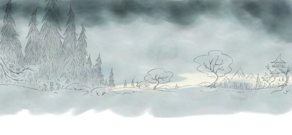
The background plane for each spread was actually made up of several sub-layers grouped together. I usually started with the far background "sky", which I created in Painter using a set of custom watercolor brushes.
Next, I added a flat base color fill to the background objects.
Using my color fills as a selection source, I added a second, richer layer of digital paint. I played around with the color jitter settings to keep things from looking too flat and controlled.
When I was done with this step, I added my text matte.
With the background art completed, I turned my attention to the characters. Using my rough sketch again as reference, I drew finished versions of the witches. Notice there's very little shading. Volume, shadow and color would be added digitally.
Using the same approach that I did painting the background, I added a flat base color.
The base color not only served as underpainting, it provided me with an easy way to make selections to constrain the next layer of paint.
Once the witches were done, I added them to my background.
I did the same thing for the bats and frogs falling from the sky that I did for the characters: fine-tuning the pencil lines, scanning and adding color.
The final step: adding a matte for the text.
Notice that the text matte above cuts a straight, steady line across the bottom of the scene. This is the format I used for scenes in the book where the witches think that everything's going great. But when things started going wrong, I switched to an irregular border to help push the feeling of chaos:
Re-reading this, it almost sounds like these illustrations were as easy as 1-2-3. In reality, Bats & Frogs took longer than most books I've done. As usual, there was a lot of muttering and grumbling and feeling lost in the weeds... maybe more than usual. But that's all part of the deal, at least for me. Once I finally got my game plan into place and established the production workflow, things went pretty smoothly... but I wouldn't say fast.
I learned a lot with this book and was lucky to have great support and insights from the creative team at Feiwel & Friends and my long-suffering wife Blake.


